
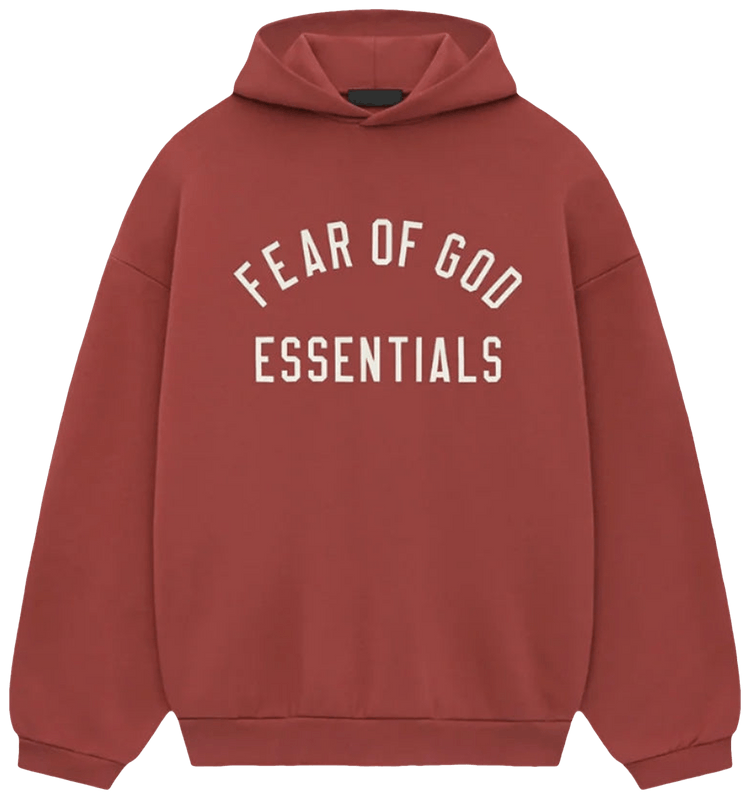
Sage. Plum. Sycamore. Peach. Say those four out loud, and they sound like paint chips from a hardware store, not hoodies, and that’s basically how this line has always thought about color — soft, dusty, a little sun-bleached, closer to a photo of the Mojave in late afternoon than to a sportswear rack. Scroll the grid at Essentials Clothing, and the same pattern repeats drop after drop: earth tones up front, a row of grays holding the middle, and one or two loud shades sitting off to the side like they wandered in by accident.
Color ends up being the whole decision, honestly. The cut barely moves between seasons — boxy body, dropped shoulders, roomy sleeves — and the logo lands in the same two spots every time. Which means once your size is sorted, you’re really just deciding what shade you want to look at twice a week for the next couple of years. At $80, down from $240, this isn’t a piece anyone babies either, so a shade that doesn’t play nicely with your jeans just ends up folded on a shelf.
Everything looks like it spent a summer outside
The faded thing isn’t an accident. When Essentials turned up in 2018 as the simpler, cheaper side of Fear of God, Jerry Lorenzo pushed the whole line toward muted, slightly chalky color rather than the bright block shades everybody else was printing that year, and nobody has walked it back since. So what you get is cotton that looks like it’s already been through the wash forty times, or dry grass in August. Nothing shouts.
Muted colors sit next to each other without clashing, which is why two Essentials pieces in different shades still read as one outfit. A bright cobalt and a bright crimson would fight. Sage and Light Beige just sort of agree.
The logo is usually the same color as the hoodie
On a lot of pieces the rubberized or flocked logo is printed in a shade very close to the fabric, so from ten feet away you don’t see lettering at all — just one flat field of color with a faint texture on the chest. It’s why a Dark Brown hoodie can look plain from across a room and then show its branding up close.
Three families, and you are mostly picking one
Sort the whole line by color, and it collapses into three groups — and once you know which one you reach for, the shopping part takes minutes.
- Off White, Beige, Tan, Cream and Light Beige — the pale group, which looks clean and summery in July and a bit dusty and lived-in by October.
- Light Brown, Dark Brown, Maroon, Olive, Sycamore, Sage, Plum, Teal, Seafoam and Mint — the earth and faded-garden group, where most of the line actually lives.
- Classic Gray, Light Gray, Smoky Gray, Heather Gray and Core Black — the quiet middle that sits happily beside both of the other two.
Most people buy inside one family and then wonder why the closet looks flat. Pull one gray in and those browns suddenly have something to push against.
Where the loud colors actually fit
Red, Orange, Yellow, Pink, Coral, Light Blue — they do exist here, mostly on tracksuits and sweatpants. I’d treat them as the single bright thing you wear, not the base. A Red hoodie with black shorts works. A Red hoodie with an Orange set does not, and you already knew that.
Mixing two pieces without looking like a uniform
Tone on tone is the simplest route: Sage hoodie, Light Beige shorts, both slightly washed out, and the whole thing reads calm rather than matchy. Contrast works too, and it’s more interesting — a Dark Brown tee with Light Gray shorts gives you a clear top and bottom.
Matching sets are where people slip. A hoodie or jacket and pants arrive together as an Essentials Tracksuit at roughly $140 to $145 for the pair. Worn as sold, head to toe in one color, it can look like you’re on your way to a practice you don’t attend.
Split the set on purpose
Wear the tracksuit pants with a Classic Gray tee instead of the matching top, or the jacket over a White tee and shorts. Then save the full matching version for a flight, when you want zero decisions at 5 a.m.
Which shades hold up, and which show everything
Pale colors are honest about your life. Off White and Cream will record the coffee you spilled in March, and the cuffs go dingy first. Blacks fade toward a slightly rusty gray if you wash them warm. Light Brown, Sage and Olive hide almost everything, which is probably why they sell out first.
It helps that the fleece is heavy, around 380 GSM where cheaper hoodies land between 200 and 300, and dense cotton like that hangs onto its dye for years — right up until it meets a hot dryer, which can undo the whole thing in about forty minutes. So wash it cold, inside out, and air dry it if you’ve got the patience, because that habit is quietly doing two jobs: keeping the shade where it started, and keeping the rubberized logo from cracking the way it does when you tumble it hot.
Key Takeaways
|
Frequently Asked Questions
What happens when a color sells out?
Some shades come back around, and plenty of them never do. Drops are seasonal and fairly limited, so a shade can vanish for a season and then quietly turn up again, occasionally in a dye that sits a little off from the one you remember. So if a color matters to you, get it while it’s there, because waiting is a gamble on whether the next batch matches the old one.
Is Off White too pale for winter?
Not really, though it behaves differently. In a cold, wet February it picks up grime faster and needs washing more often, and washing is its own kind of fading. For a single winter piece, Dark Brown or Smoky Gray stays fresher with less effort.
How many colors do I actually need?
Two, in most cases. One neutral that disappears into everything — gray, black, beige — and one color you genuinely like looking at, say Maroon or Teal or Plum. A third only makes sense once you know what’s missing.
If there’s a shade you keep scrolling back to, that’s probably your answer, and sizing and fabric weight can get sorted later. Color is the bit you live with every morning.
READ ALSO: Layering an Essentials Hoodie Through a Milan Winter