
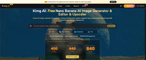
Imagine a fintech startup publishing an article about digital wallets. The accompanying illustration shows money moving instantly between two banks, with bright arrows and a reassuring security shield. The image looks professional, but the article never established that transfers were immediate or completely secure. Readers may remember the visual promise more clearly than the written qualification. As financial companies experiment with image-generation resources such as Kimg AI, this problem deserves attention. Effective financial illustrations should make complicated ideas easier to understand without presenting assumptions as proven facts.
Why Financial Images Carry More Authority Than Ordinary Decorations
Readers often approach financial information with practical questions. Is this payment method safe? How does a loan work? What happens to my investment if prices fall?
An illustration can make an unfamiliar subject appear approachable. It can also make an uncertain statement look settled.
For example, showing a cryptocurrency wallet behind an enormous padlock may imply security that depends on many separate factors, including device protection, private-key management, and user behavior.
The danger is not necessarily a false number displayed on the screen. It is the impression created by the image.
Financial brands should therefore evaluate visuals against the same standard they apply to written explanations.
Ask what an uninformed reader might conclude after seeing the image without reading the article. If that conclusion is stronger than the evidence, the artwork needs revision.
The purpose of a financial illustration should be understanding, not an exaggerated feeling of certainty.
Choose the Right Visual Format for the Information
Different financial subjects require different kinds of images. An educational explanation of a banking concept needs something different from a presentation of historical market performance.
Consider these distinctions:
| Subject | Better visual approach | Common risk |
| Payment process | Simplified process diagram | Implied instant settlement |
| Investment risk | Balanced conceptual illustration | Suggesting guaranteed growth |
| Savings habits | Everyday financial situation | Unrealistic wealth promises |
| Market performance | Verified data chart | Invented price movement |
| Digital security | Specific security behavior | Suggesting perfect protection |
The distinction between illustrations and charts is especially important.
A conceptual illustration can show someone comparing payment options. It cannot establish that one option has lower fees without verified information.
Similarly, an artistic image of a rising stock-market arrow cannot substitute for accurate price data.
Use images to explain a situation or introduce a subject. Use properly sourced charts when readers need numerical evidence.
Keeping those purposes separate helps prevent attractive graphics from becoming accidental misinformation.
Three Financial Topics That Require Extra Visual Care
Some financial concepts are particularly vulnerable to misleading visual shortcuts.
- Cryptocurrency and Digital Asset Security
A shield surrounding a digital coin is easy to recognize, but it says little about actual protection.
Wallet security depends on questions such as who controls the keys, how recovery information is stored, and whether transactions can be reversed.
An educational image might instead show someone securing a recovery phrase away from their computer.
That scene gives readers a more specific behavior to understand.
Avoid implying that a particular wallet, exchange, or token is completely safe unless the article provides relevant evidence and explains its limitations.
- Credit, Lending, and Personal Debt
Financial advertising often presents borrowed money as immediate relief from a problem.
However, borrowing also introduces repayment obligations, possible fees, and interest costs.
A balanced illustration might show a person reviewing a repayment schedule before accepting an offer.
That image is less dramatic than cash appearing instantly, but it better supports responsible educational content.
For articles about lending, visual clarity matters because readers may be making consequential decisions.
The design should support an explanation of terms rather than encourage impulsive borrowing.
- Investments and Market Forecasts
An upward arrow is perhaps the most familiar financial illustration. It is also one of the easiest images to misuse.
A rising arrow next to an article about an investment strategy can suggest that gains are expected, even when the text discusses uncertainty.
Instead, use neutral financial scenes or clearly labeled conceptual graphics.
If the article contains specific market predictions, ensure any chart comes from verified underlying data.
Never let generated artwork invent price histories, company performance figures, or investment returns.
A Practical Review Process for AI-Generated Financial Images
Financial publishers can use generative images without treating every output as publication-ready.
The process should start with the article’s central explanation.
Suppose the article describes how a small business compares payment providers. A suitable illustration might feature a merchant reviewing different payment options at a desk.
That scene communicates the decision being discussed without claiming which provider is best.
Image-generation resources such as Nano Banana AI can help explore those contextual scenes using descriptive prompts and reference-based image editing.
The next step is editorial review, not automatic publication.
Reviewers should answer four questions:
- Does the image introduce any factual claim not supported by the article?
- Could a reader mistake a conceptual illustration for a real transaction or event?
- Are logos, interface details, or text inaccurate or misleading?
- Does the image make a risky financial decision appear unusually simple or safe?
Any uncertainty should lead to revision, clearer labeling, or a different visual approach.

Distinguish Financial Education From Financial Promotion
A fintech company may publish educational articles and promotional materials on the same website. Their visual requirements should not be confused.
An educational article explains how something works. A promotional page encourages readers to consider a particular service.
Both can use illustrations, but promotional imagery needs careful attention to the claims it implies.
For instance, a colorful image of a smiling customer receiving a loan may be suitable as generic lifestyle artwork. Yet its surrounding copy should not imply guaranteed approval, zero fees, or universal eligibility unless those statements are accurate.
Editorial context also matters.
If a generated image depicts a fictional person, do not present that person as a real customer sharing a genuine experience.
When discussing actual financial institutions, avoid generating images that appear to document events that never occurred.
Use real evidence for real events, and conceptual artwork for concepts.
That separation protects readers from confusion while allowing publishers to make technical subjects visually accessible.
How to Build a Small Library of Trustworthy Financial Illustrations
A publisher does not need a unique visual treatment for every article. A consistent collection of carefully reviewed concepts can support recurring educational topics.
Start with common reader questions, such as comparing payment methods, understanding transaction fees, protecting account access, and planning monthly spending.
For each topic, develop a neutral visual scene that can accompany different explanations without asserting specific financial outcomes.
Keep a record of what each image is intended to represent. This is particularly useful when several editors publish to the same website.
Avoid embedding dynamic market prices, dates, or regulations into decorative images. Such details can become outdated.
Review images again when articles are substantially updated. A previously suitable illustration may become misleading if the subject or argument changes.
Most importantly, remember that consistency should concern editorial quality rather than identical-looking graphics. A useful visual library contains recognizable standards, not endless repetition of one generic finance image.
Conclusion
Financial illustrations can make difficult topics more accessible, but their persuasive power creates responsibility. Images should clarify processes, decisions, and relationships without inventing guarantees or strengthening claims beyond the evidence. Publishers can reduce risk by separating conceptual art from verified charts, reviewing visual implications, and choosing concrete scenarios instead of exaggerated symbols. The next time you prepare a fintech explainer, evaluate the accompanying image as carefully as the headline. Ask what the picture appears to promise, then make sure the article can support that impression.